Bad Cover Art…Redesigned: Fall For Me
Welcome to Bad Cover Art…Redesigned! Where I bring you the most horrible of all cover art I can find on the world wide web and try to come up with an alternative (that I hope is better).
This week I bring to you: Fall For Me by Melanie Marks

According to Amazon, Fall For Me is about Zoey Jones. Recently her boyfriend Finn cheated on her by kissing another girl and through guilt gives Zoey a free pass to kiss any guy she wants. Zoey knows exactly who she wants to kiss, Finn’s best friend Riley. However she resists until Finn loses a bet to Riley and Riley knows exactly what he wants, a kiss from Zoey. DRAAAAAMA!
I now bring to you Fall For Me…Redesigned!

Thoughts –
I’m baaaaaaack! Had a little hiatus last week after my wrist started to kill and photoshopping only made it worse. So thank you very much to Kyllorac for filling in!
So this week I kind of wanted to do something different. I do a lot of Sci-Fi, Fantasy, Horror, etc. This week, after seeing some of the Cover Flips that were made for Maureen Johnson’s contest, I decided to have a wee dabble in romance covers. I found the above cover and whilst it’s not awful by any stretch I just thought that maybe something more interesting could be made from it, to make it stand out a little more.
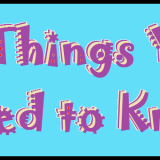
I thought it might be interesting to concentrate on the font, as in making the font the feature rather than a particular image. I had two covers I could’ve chosen but this one gave me an idea first. I thought it would be a cool idea to have a falling font or a hanging font or something like that. So I set about on Google looking for a tutorial or examples that might inspire me. I found a couple that looked interesting and then set about making my own font. What you see on my redesign is a normal font that I have adapted myself to look like that. Obviously with the idea of falling I thought it would be good to have a sky sort of background and it just sort of seemed to fit within the romance genre.
I’m still not entirely happy with my redesign. To me there is still something off. Maybe I should’ve spent more time on the font and perfecting it but I had to like…sleep. However in comparison to the original I think the redesign is a little more interesting. You might stop to have a look at this cover rather than just passing it by as another generic romance story with another generic romance cover.
Process –
Step 1 – Adjusted background to fit
Step 2 – Added all font and changed text layer to rasterized layer so I could adjust it how I wanted
Step 3 – Used Gaussian Blur on the font and gave it a slight outer glow and also a drop shadow
Step 4 – Added the rope using the pen tool and then used stroke path to make it solid with the brush tool
Step 5 – Used free transform to adjust the letters onto the line and then cut out little holes so it looks a little like they are hung on the line.
Step 5 – Placed the falling letters and then duplicated the layers/letters twice and moved them slightly above each other and reduced the opacity.
Step 7 – Added author name in blue to give the cover a bit more variety and then gave it an outer glow to make it stand out more
Step 8 – Added the heart using a brush and put the text inside it
Elements –
Tutorial For Hanging Font (Again I kind of picked the steps I wanted)
Thanks for taking a look! 🙂


I like the airy look to this. The falling font is very cool, but it does make it a bit difficult to read the title, especially with the novella heart, which is a bit in the way.
Great but reading the title is kinda difficult as Twit already said.
This probably would have been a little bit better if the top “A” was not as transparent, and then the falling letters became more transparent. 🙂